2025.1.22
[PLST] A month and a half sprinted through as an all-hands team: the behind-the-scenes of a project led by the members who will carry the next generation
Mid-August 2024.
In a season with lingering humid heat, production began on a feature page for “winter beautiful-leg pants.”
The launch was set for early October, and the production period was about a month and a half. While a normal project takes at least three months to half a year, this was an extremely tight schedule. To realize “good, mount-like making,” we produced everything within the limited time — from examining the plan all the way to the materials.

Members
Speakers
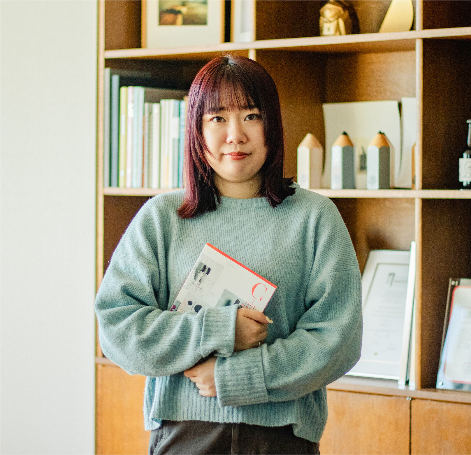
Marin Yamasaki
Des
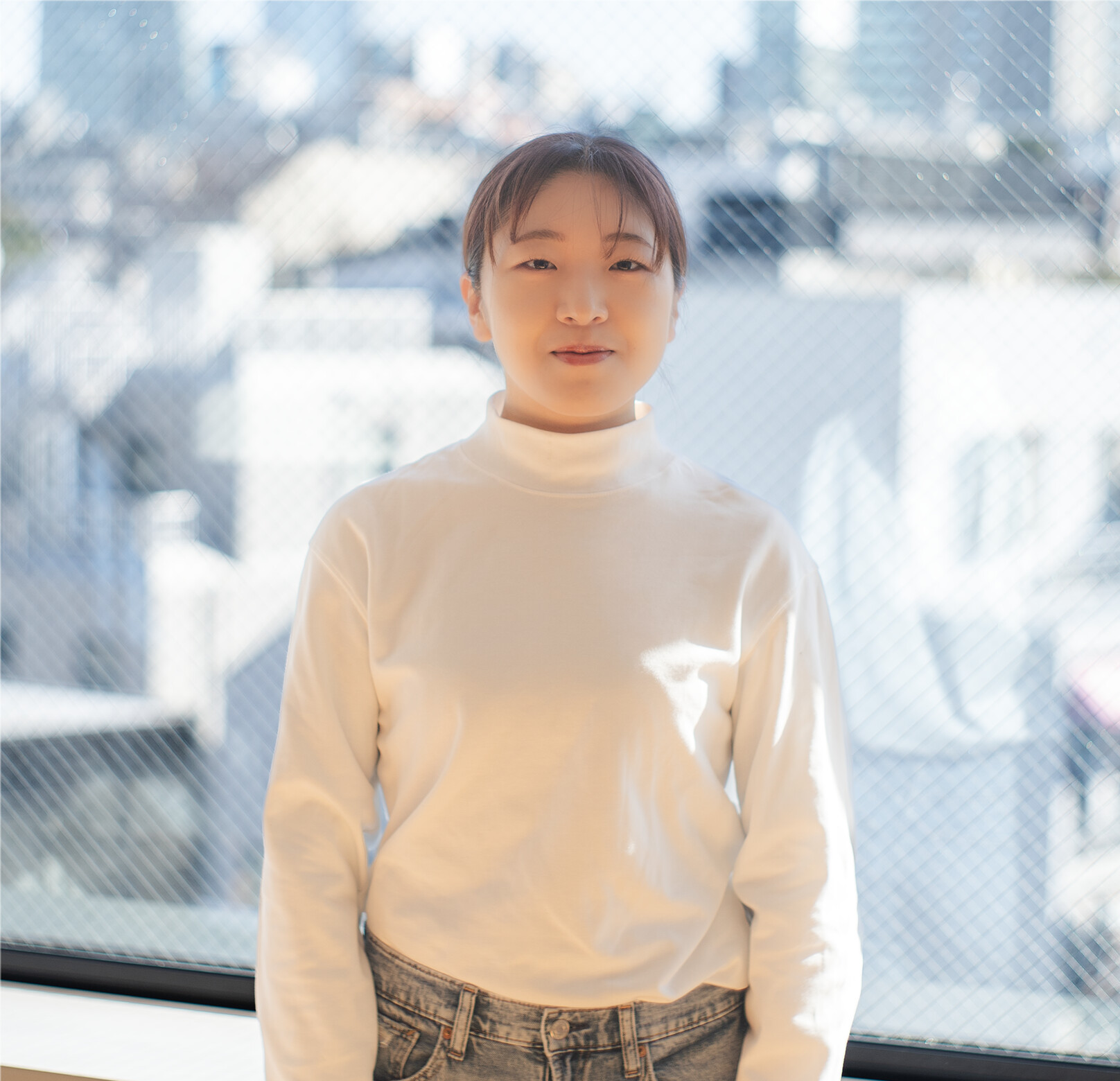
Shoko Nakahashi
Dir
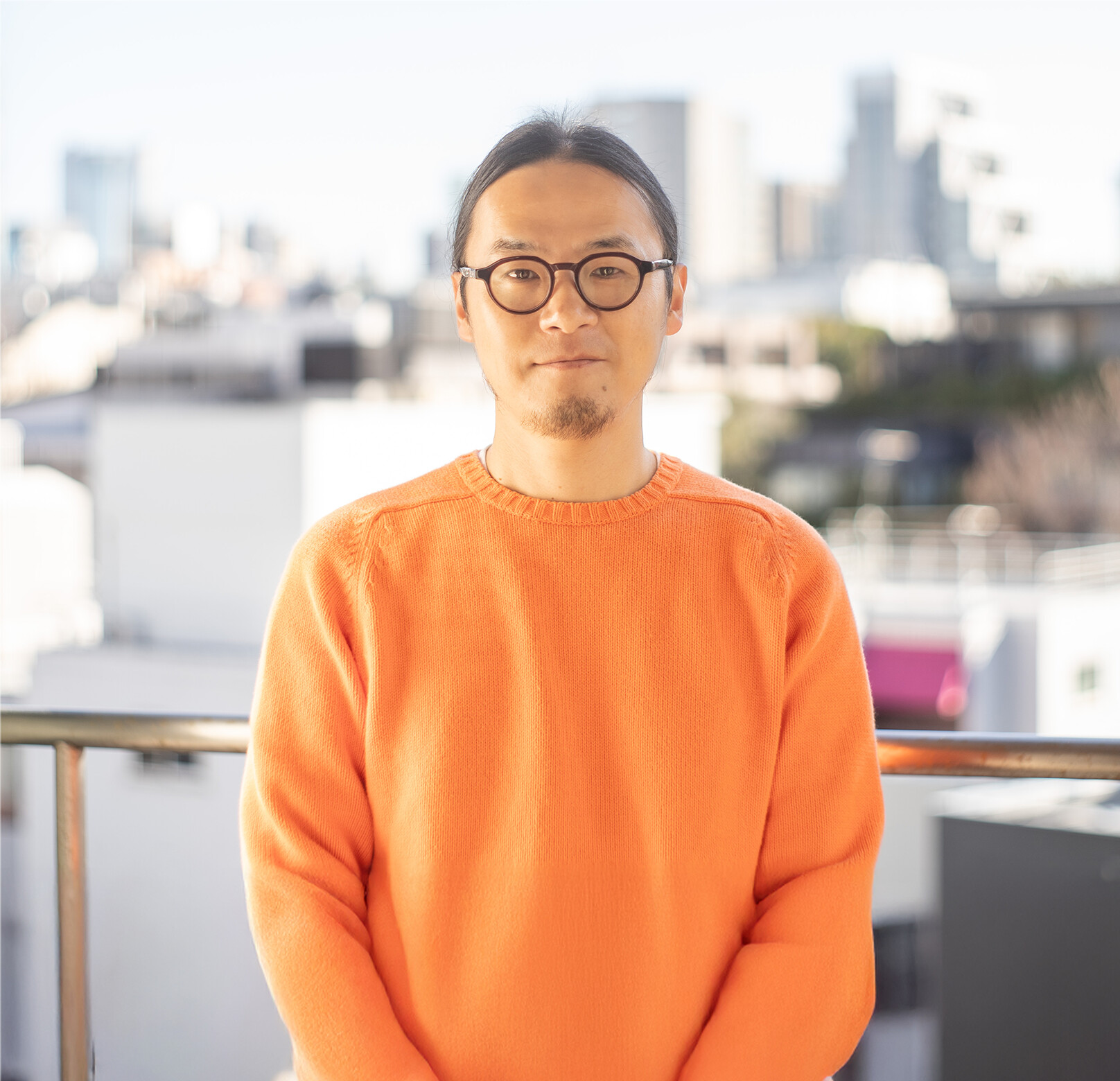
Hidekazu Hayashi
AD
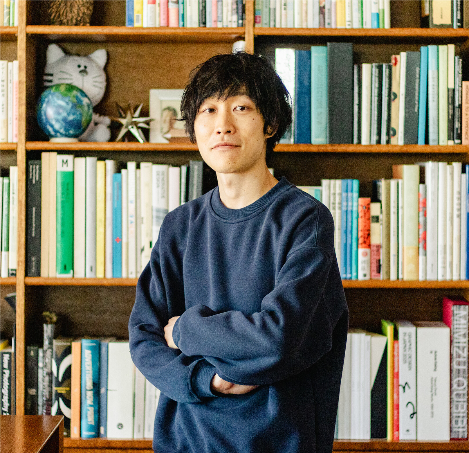
Kenji Okabe
TD
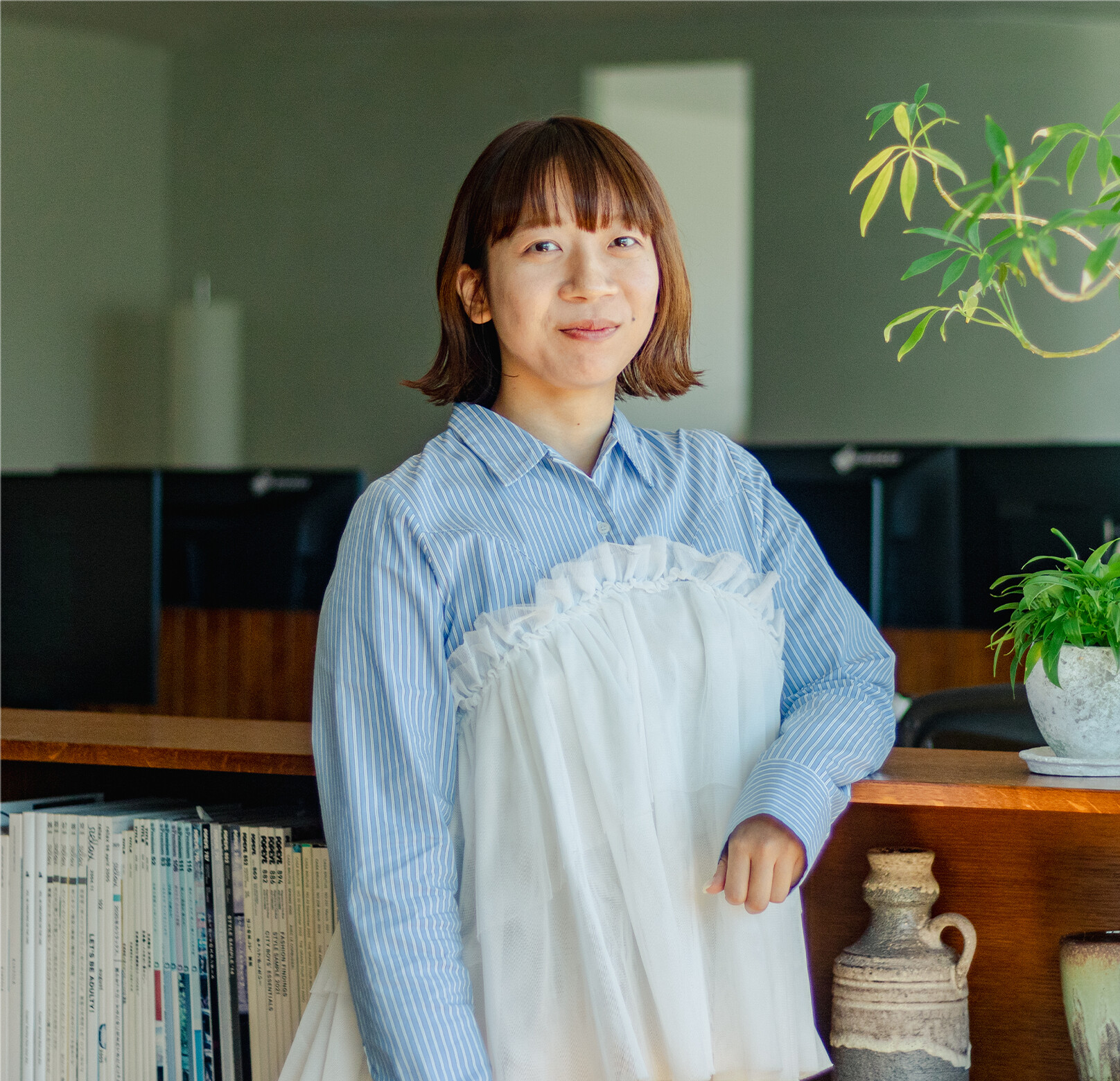
Akari Yamashita
Dev
Photography
Kenji Okabe
TD
Contents
An all-hands challenge that overcame a race against time

Shoko Nakahashi
It was a project the phrase “a race against time” fit perfectly, yet we could proceed without compromise thanks to the support of many people. Within the limited time, we managed to realize the very most we were capable of.
Marin Yamasaki
I, too, was anxious and tense every day after kickoff…
Even so, it was precisely because everyone gave their all at every stage, without the slightest compromise, that we could see this project through. Being able to produce from scratch not only the planning, design, and implementation but all the materials (photos, words, and so on) to convey the appeal of the Warm Reserve pants was thanks to the professional, swift response of our client and partners.
Shoko Nakahashi
Our in-house production members, too, worked as one from morning to night day after day, continuing to polish design, implementation, and sound production up to the very deadline in pursuit of something better. With every stage advancing at once, working as one let us bring out our strength as a team. Through this project, I felt anew how supported we are by so many people.
1. The planning phase
This project started at full throttle right after kickoff.
In the planning phase, we advanced simultaneously the planning, wireframe creation, structural study, examination of visuals and photo materials, and even the selection and assignment of a copywriter and photographer. The period in which we pushed all of this forward was just one week.

An attempt to protect PLST-ness while creating a new impact
The hardest part of deciding the plan was how to present the Warm Reserve pants.
This product uses a proprietary fiber co-developed with Toray, warm on its own and superbly comfortable. On top of that, it features a beautiful-leg silhouette embodying PLST’s brand concept, “everyday clothes for when you want to look put-together.” The whole team debated again and again how to convey these strengths and the website’s impact in good balance.
Marin Yamasaki
Especially at the stage of deciding content and visuals, I agonized over the balance of making a website that followed the brand concept — not too flashy, yet with impact.
Shoko Nakahashi
The client asked us to “carry on the PLST-ness familiar to existing customers, while also creating impact on the web.” Without harming the product’s elegance or the brand’s mood, we pursued an expression combining polish and a put-together feel, debating repeatedly with AD Hayashi and TD Okabe.
Hidekazu Hayashi
In the end, to reconcile PLST-ness with the appeal of the Warm Reserve pants, we newly produced all the materials (photos, text, and so on) under our lead. With content built from scratch rather than relying on existing assets, we could convey the product’s appeal more vividly.

What if wearing the pants made you “float”?
As we extracted and organized the appeal of the Warm Reserve pants, the keyword that emerged was “a catch” — something that snags your attention. Though the pants’ design is simple, we began exploring how to make viewers feel a slight strangeness: “there’s something different about these…?” What came out of that was the idea: wouldn’t it be interesting if the model’s feet floated?
Marin Yamasaki
The keyword “float” first came from Okabe. He knew a photo book in which people in everyday scenes appear to be flying, and it started from the idea, “how about this kind of strangeness?” But there are many kinds of floating — whether the person is jumping of their own accord, being lifted, whether you sense their will — and nailing down why and how they float was the difficult part.
Shoko Nakahashi
At first we thought only the angle of the feet would be somehow curious — just enough to feel not-quite-grounded — but it was updated bit by bit from the initial concept, aligned with the client, and in the end became less a sense of floating than a way of floating that moves forward with intent. Aligning this nuance, and the meaning of floating, with the client was quite hard…
The birth of “Nessen-kun,” the little heat source, to express warmth
Shoko Nakahashi
There are many designs that convey “warm” in the world, but most of them relied on thermographic imagery. In devising the direction, with “don’t fall back on thermo” as our watchword, we searched for a way to feel warmth intuitively.
Marin Yamasaki
The idea that came out of that was “a heat source circling near you.” Wouldn’t it be interesting if something like a lump of heat affected the person wearing the pants? We called this interaction “Nessen-kun” (little heat source).

2. The design and implementation (run-up) phase
In the design phase, implementation, copywriting, model auditions, and shooting proceeded in parallel with design.
For the words, after organizing the points we wanted to convey, copywriter Mai Miura lent her strength to express them precisely. She responded immediately day after day and helped us greatly. As for the shooting, thanks to amana’s efforts, we were able to carry out the various arrangements, preparations, and the shoot itself smoothly in a short period.

Team-building and thorough verification toward realizing the ideal visual
To realize the ideal visual, we carried out model assignment and auditions, styling, and the team-building to make it all happen together with amana, advancing the shoot and retouching while layering on fine adjustments.

Shoko Nakahashi
In the test shoot, we thoroughly verified angles where the soles of the feet look natural and angles that convey the sense of floating. For the real shoot, we also captured material of just the soles for retouching. The retouchers kindly met even our unreasonable requests within the short schedule — I can only be grateful… It was memorable that the PLST team, seeing the result, were delighted, saying, “Thank you for finishing it so the pattern of the pants looks this beautiful.”
Marin Yamasaki
Beyond the sense of floating, we also repeatedly tested an expression where the interactive heat source seems to bleed its color onto the pants. Thanks to Okabe advancing mock-up production early, we could share nuances hard to convey with still design images alone, and could use that in the test shoot as we verified.

Devices to show Nessen-kun realistically and effectively
Kenji Okabe
As for Nessen-kun, warm air drifts around the pants the model is wearing, and it became a “good guy” that shows various expressions in response to user interference like scrolling, the cursor, and taps. Nice to the touch with the cursor. Nice as it always drifts softly. Nice in transitions. There was a difficulty in reconciling all of that in a single simulation. What doxas explained on WebGL Souhonzan says it all — he looked at it that precisely and carefully, so please do check it out.

Akari Yamashita
Touched on a smartphone, Nessen-kun shows a different expression than on PC. It was memorable that Okabe, who had been devising all sorts of things to draw out Nessen-kun’s charm even on a smartphone’s small screen, said when he reached the current form, “That guy’s a good one, isn’t he.”

[Explaining how Nessen-kun works]

Shoko Nakahashi
I’m curious how Nessen-kun works — could you explain just a little, so even I, who don’t know the mechanics well, can understand…!
Kenji Okabe
As for the heat source drifting around the model, its origin point is simply rotating and swaying — put more plainly, it’s just two automatically moving cursors. We specify the range they move within for each individual image.

Shoko Nakahashi
I see…
And how did you do the effect where the heat source’s light reflects onto the model?
Kenji Okabe
We mask three overlapping images (stacked as below) with the information of the trajectory the heat source draws, so the color transfer is reflected onto the image near the heat source.

Kenji Okabe
In the background we render something colored according to the direction you move the cursor or trace with a finger, plus a visualization of the force’s strength; cross-referencing them, we devised a clipping-mask technique to make it look natural.
The fine play of photographer Yushi Kaku, who proposed color-transfer photos in two colors, shone through and let us make a richer effect.

Shoko Nakahashi
It was good that we could show the heat-source mock-up to Kaku during the test shoot. I think it was possible precisely because we were running alongside each other.
3. The implementation and finishing phase
In the final implementation phase, uncompromising design polishing, sound production, and photo retouching proceeded in parallel. Feeling the raw tension of the deadline drawing ever nearer each day, each of us kept polishing.

“Three-dimensionality” to convey the material’s texture and silhouette
Akari Yamashita
Besides Nessen-kun, I think the way the photos are shown three-dimensionally is one of this site’s points of care. Looking three-dimensional made the silhouette of wearing the Warm Reserve pants easier to convey.
Kenji Okabe
Placing a 2D model image in a deep, infinitely distant space inevitably creates a sense of wrongness, and resolving it was very difficult. Through much trial and error, we reached the current form.

Akari Yamashita
We finely adjusted the depth map to make the 3D more natural, didn’t we. The three-dimensionality of the image on the MEN’S page where you can see the inside of the jacket is especially clear compared to elsewhere, and I was really moved when I checked the actually implemented version.

Fine care in the organic, iconic UI as well
Marin Yamasaki
In the design, since we made the heat source and the site’s colors overall light and translucent, we layered on a lot of study and verification so the cursor, buttons, and so on could be unified into a fluid, translucent impression, and settled on the current form.

Akari Yamashita
The organic, springy movement of the cursor and buttons is really cute, isn’t it.
Marin Yamasaki
We polished the cursor movement right before launch, too.
The circular motion made the changes in the action the cursor indicates clearer, finishing it into a charming, cute movement.

Kenji Okabe
Hayashi gave me feedback that since just changing the text inside the cursor makes the change hard to notice, why not add a circular motion? — and I reflected that. The initial idea of the drag motion for the indicator was also realized thanks to Hayashi’s advice.
Akari Yamashita
Personally I also love the hover on buttons and links. It’s implemented with the image of the heat source the cursor brought along warming the button or link so it takes on color.

Sound-making to further pursue “nice to the touch”
Shoko Nakahashi
Why did you decide to add sound at this timing? Hayashi, in charge of sound-making, please tell us!
Hidekazu Hayashi
I thought it’d be better to have sound at the moments the heat source or scenes switch, so I read the room and just made it ahead of time.
Akari Yamashita
I was surprised when, after the implementation proposal, you said “actually, I’m making the sound” and let us hear some demo tracks.
Hidekazu Hayashi
At first it was a waltz with a light, walking-like beat, and I tried having sounds layer up scene by scene thinking it’d be interesting, but it was busy and not effective, so I dropped it. Then, while looping it as BGM, I made sounds play in sync with the heat source, and at scene switches and on hover/click, and prepared several patterns of sound effects so you can enjoy a variety of sounds.
Marin Yamasaki
On the website we let users choose whether to have sound, but with sound the immersion increases sharply, so I’d be glad if you’d view it with sound on.
Wrap-up
This project was realized precisely because of the all-hands effort of a team that kept challenging without compromise within the limited month and a half, and the warm support of our client and partners. This site, with everyone giving their all at every stage and polishing it to the very last, is packed with the passion and feeling of many people. The experience gained within a demanding schedule connected to the whole team’s growth and confidence, and became great nourishment for the next challenge. With the cohesion cultivated through this project in our hearts, we’ll keep aiming higher.

With the new year here and cold days still continuing, the Warm Reserve pants are sure to be a great help.
We’d be delighted if even a few more people who see the site take an interest in the Warm Reserve pants.
Thank you to the many gallery sites and roundup articles that featured us, too. Looking one by one at the articles that introduced this site, we were able to spend a lovely end of 2024.
2025/01/22 Edit : Akari Yamashita