2026.8.20
Beyond the Screen: Seven Projects Where the Web Created Value in Outdoor Advertising, Exhibitions, and More.
Every project calls for different forms of expression and different touchpoints — words, video, the web, graphics, exhibitions, signage. What you're delivering, where, and how all shape which tools you reach for.
The seven projects featured here make that difference clear. Multiple touchpoints show up in each one, but no two are combined in quite the same way.
In one project, a world we built for the web spread into an exhibition and a newspaper. In another, a production tool we built for the web ended up powering a TV commercial and a large-scale screen. In others, the web was given a role entirely separate from the physical space.
Differences that are hard to spot one project at a time become clear once you line them up side by side: what stayed consistent, what changed from medium to medium, what was left to the web, and what was left to the physical space. Here, we compare all seven.
Contents
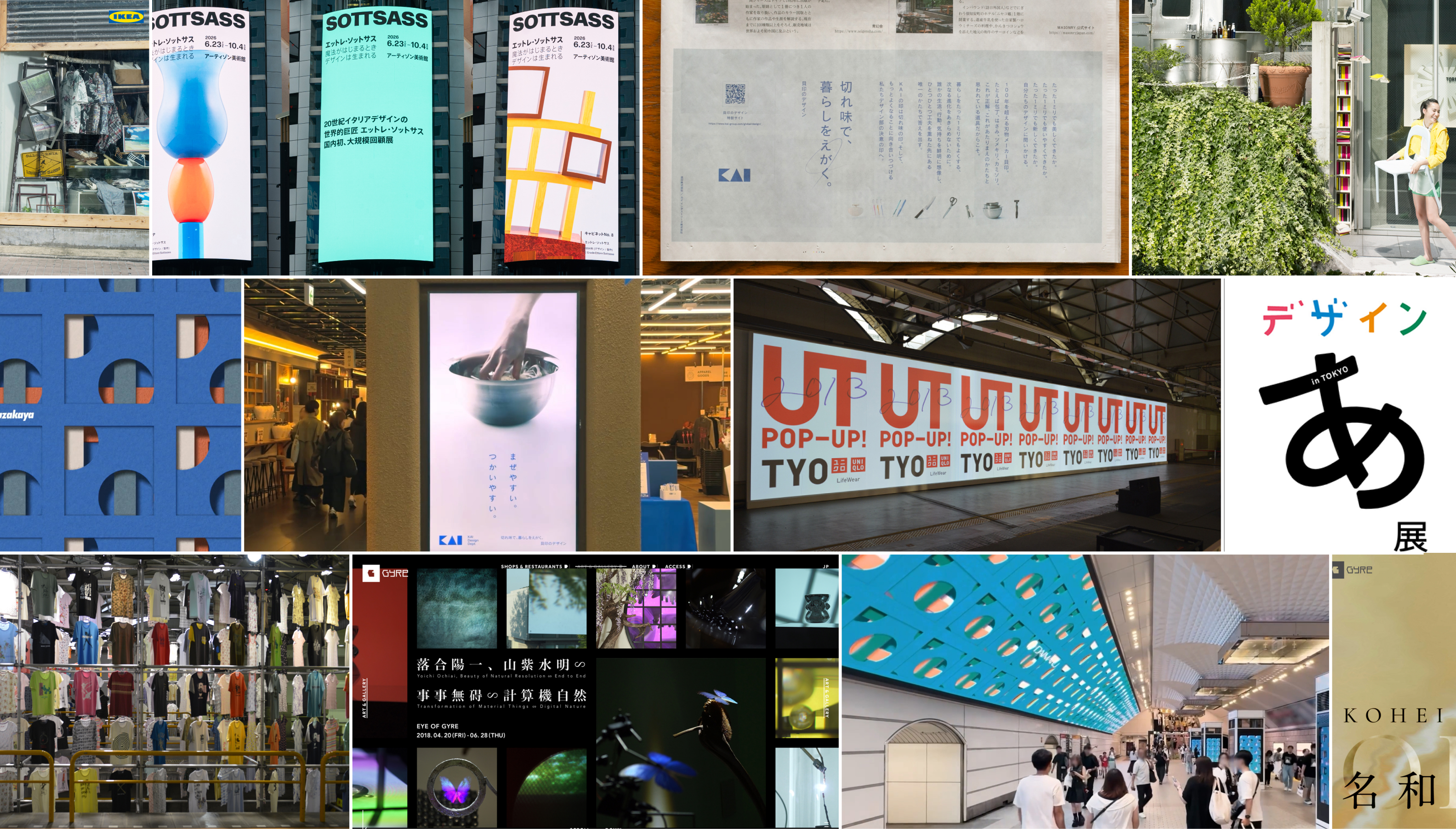
Seven Projects at a Glance
・KAI DESIGN Dept. (2025) | Web, Exhibition, Newspaper
・Daimaru Matsuzakaya "Hyakuyozu" (2025) | Web, TV Commercial, Signage
・ARTIZON MUSEUM "Ettore Sottsass" (2026) | Exhibition, Web, Video, Large-Scale Screen
・IKEA "SUKIMA GALLERY" (2012) | City-Wide Event, Web
・UNIQLO "UT 2013" (2013) | Pop-Up Store, Projection, Web
・Design Ah! Exhibition (2020) | TV Program, Exhibition, Web
・GYRE GALLERY (2019–) | Exhibition, Web
It's Not Just About Moving the Same Thing to a Different Medium
The first two projects are cases where something born within the project spread into a different medium. For KAI, it was a world view that spread. For Hyakuyozu, it was the mechanism for generating the expression itself.
KAI “KAI DESIGN Dept.” (2025)
A World View, Extended into an Exhibition and a Newspaper
“KAI DESIGN Dept.” is a project built to communicate KAI’s design philosophy to a wide audience.
The brief called for more than showcasing individual products — it needed to contribute to the company’s branding as a whole. So we visited Kai’s own factory and interviewed members of the design department, working through their aesthetics and values around craft (monozukuri). From that, we defined a main copy line, a statement, and “Bi no Shirushi” (the Mark of Beauty), the three perspectives underpinning Kai’s design.
Rather than explaining that thinking through text alone, we designed the website to let people feel the sharpness, usability, and design sensibility of the products firsthand. We planned for on-site web behavior from the video production stage onward, creating “touchable video” that viewers can intervene in through their own actions. Using both WebGL and Blender, we aimed for an experience that feels like actually touching the products.
🔗Kai | View the KAI DESIGN Dept. project details

The website we built then extended into other media as well.
For Kai’s concept design exhibition, “Sharpness and Gentleness,” we produced vertical signage video for the venue, testing how it would read within the exhibition space while keeping it true to the same world view as the website. The design philosophy we established for this project also appeared in an advertisement in the Nikkei newspaper.
The signage and newspaper ad both emerged as offshoots while the project was underway. Rather than staying confined to the website, we worked out the best way for each medium — exhibition space, print — to present the material. Starting from the web, we carried Kai’s design across media.

Daimaru Matsuzakaya “Hyakuyozu” (2025)
A Production Mechanism, Extended into a TV Commercial and Large-Scale Screens
Daimaru Matsuzakaya’s new visual identity, “Hyakuyozu,” is a dynamic pattern created by the Misawa Design Institute at Nippon Design Center, in which five overlapping sheets of paper move to generate endless patterns.
Could this visual identity be “experienced” on a website? We aimed to let people feel the overlapping and shifting of the paper — even its slight resistance — on screen, and to communicate the structural fascination and infinite possibility of “Hyakuyozu” without relying on words alone.
To do that, we developed a dedicated WebGL tool for Hyakuyozu.
We built a production workflow where you could set the paper’s size and color, the shape of the holes, how the sheets overlap, camera work, and animation, and see the results reflected directly on the website. Working alongside the designers at the Misawa Design Institute, we fine-tuned the precision of the patterns and movement by actually handling the implemented test site together.
🔗Daimaru Matsuzakaya | View the Hyakuyozu special site project details

This tool wasn’t used for the website alone.
For the Hyakuyozu promotion, we also produced a TV commercial, a TVer commercial, digital signage in department stores, and large-format signage inside train stations. We adapted the web tool for video editing and put it to work in film production as well.
At the same time, the viewing distance and screen size for the web and for the large station screens are completely different. We tested using a projector at close to the actual projection size and adjusted the scale of the pattern and text size for each accordingly.
Placing the two side by side, you notice that even though both projects expanded across multiple media in similar ways, what carried over from one medium to the next was different.
For KAI, the design philosophy and world view carried over into different touchpoints — an exhibition space and a newspaper. For Hyakuyozu, it wasn’t the finished expression that spread into the commercial and signage, but the production tool that generated it.
What emerges is a way of expanding that goes beyond simply “putting the same design on a different screen.”
Ettore Sottsass: Design begins where magic begins (2026)
Color and Form in Motion, Carried into Video and the City
We planned and produced the website for the “Ettore Sottsass: Design begins where magic begins” exhibition held at the Artizon Museum.
We extracted the vivid colors and geometric forms found in the works and expressed them as motion graphics. Rather than simply lining up the exhibited pieces, we let colors and forms unmistakably Sottsass’s own move and unfold, creating another entry point on the web.
Following the website, we also produced a promotional video. That video was screened on the “Shibuya Mega Wall,” located at the intersection of Dogenzaka and Bunkamura-dori.
The movement of color and form we launched on the web became video, then reached a large screen in the middle of the city. Anchored by a shared visual language, the touchpoints extended beyond the screen.
🔗Artizon Museum | View the “Ettore Sottsass: Design begins where magic begins” project details


Because the Real Space Exists, We Give the Web a Different Role
The next two projects are cases where a city-wide event or an exhibition and the web exist side by side. Rather than transplanting the real thing directly onto the screen, each touchpoint is given a distinct role.
IKEA “SUKIMA GALLERY” (2012)
Connecting 14 Scattered Galleries Into One
Held in the summer of 2012, IKEA’s “SUKIMA GALLERY” was an event that displayed furniture in the gaps between buildings and under staircases around the city.
Fourteen galleries were set up around the city, each letting people experience how “even the smallest gap can be styled beautifully with the right idea.”
The special site introduced each “space” that appeared around the city through visuals that included the cast. We also added background music built from ambient city sounds, so visitors could feel the atmosphere of the event on the web too.
Each gallery page also had a “Like” button. Clicking it entered visitors into a campaign to win, by lottery, an IKEA gift card worth the full set of items used in that gallery.
Here, the fourteen displays around the city and the web work in tandem — showing the real spaces online while also leading people all the way into the campaign.
🔗IKEA | View the SUKIMA GALLERY project details

UNIQLO “UT 2013” (2013)
Video Born at the Venue, Delivered Both On-Site and on the Web
For “UT” in 2013, communications unfolded across multiple media — pop-up stores, TV commercials, in-store monitors, and websites — centered on “UT CAMERA,” a smartphone app that converted recorded video into unique animation.
We were responsible for the website and the projection at the pop-up store. Video shot on-site with “UT CAMERA” was projected live at the venue and reflected on the website at the same time, letting people watch and “like” footage filmed and posted from around the world. UT POP-UP launched in Shibuya before expanding to New York, Taiwan, Paris, London, Singapore, and more. On the website, we shared event information from each location while putting the submitted videos to use, aiming for a structure that conveyed both the energy of the venue and the sight of participants enjoying the app.
Here, content born in the real space became part of the staging on-site while also accumulating on the web at the same time. The mechanism of moving back and forth between the venue and the web became part of the experience itself.
🔗UNIQLO|UT 2013


Design Ah! Exhibition (2020)
Not Reproducing the Exhibition, but Creating Another Experience Entirely
The website for the “Design Ah! Exhibition” was created when “Design Ah,” the NHK Educational TV program, was staged as a physical exhibition.
We positioned this website as “the thing in between” — between the “Design Ah” you watch on the program and the “Design Ah” you experience at the venue.
Built on a simple, clear design, we implemented interactions that made use of the “Ah” logo at the heart of the brand. Rather than a site meant only for checking information, we aimed for something that would make people want to keep moving things around just to see what happens.
Rather than transplanting the exhibition’s content directly onto the screen, the web expresses a “Design Ah–like experience” through interactions you can touch and move.
🔗View the Design Ah! Exhibition project details
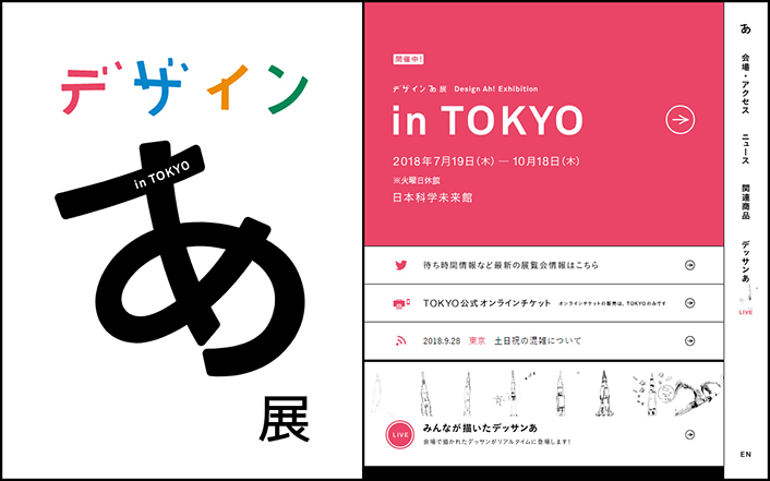
With IKEA, fourteen spaces scattered around the city were connected into one, creating an entry point into participation. With the Design Ah! Exhibition, what was created was neither the program nor the exhibition, but a hands-on, playable experience.
Rather than matching the content of the real space and the web, the question is what’s possible because of each specific touchpoint. That’s the difference visible between these two projects.
Even the Same Gallery Doesn't Get the Same Treatment Twice
GYRE GALLERY(2019–)
When the Exhibition Changes, So Does the Angle for Telling Its Story
Last is the promotional site for GYRE GALLERY in Omotesando.
For several years now, we’ve continuously planned and produced promotional sites for each exhibition held at GYRE GALLERY.
Contemporary art, craft, fashion, design, architecture — since the theme and the work differ enormously from one exhibition to the next, rather than communicating everything in the same format, we’ve sought out the “optimal angle” to match each exhibition’s individuality and changed our promotional approach accordingly.
Comparing several of these exhibitions side by side makes the difference clear.
Yoichi Ochiai: Beauty of Natural Resolution End to End Transformation of Material Things Digital Nature (2018)
Stepping Into the Work Through a Long-Form Interview
For Yoichi Ochiai’s solo exhibition, we designed the content around a long-form interview with the artist himself, aiming to deliver the complex world view held within his body of work in an accessible way.
We deliberately built the visuals of the work and the venue from fragmented photos and video clips, aiming for the immersive feeling of touring the gallery together while being guided by Ochiai himself.
We also aimed for the content to do more than build anticipation and understanding before a visit — we wanted it to function afterward too, as something visitors could use to dwell on the afterglow and deepen their thinking.
🔗GYRE GALLERY | View the Yoichi Ochiai: Beauty of Natural Resolution End to End Transformation of Material Things Digital Nature project details


Kohei Nawa Solo Exhibition “Oracle” (2020)
Getting Closer to the Artist’s Thinking Through Monologue
For Kohei Nawa’s solo exhibition “Oracle,” we expressed his own thoughts — including why he keeps making work — as a monologue in his own words.
What we aimed for was having the thinking behind the exhibition come through directly. Even though this, too, uses the artist’s own words, rather than the interview format used for Ochiai’s exhibition, the structure here draws you into Nawa’s own point of view.
🔗GYRE GALLERY | View the Kohei Nawa “Oracle” project details


“Future City Shibuya: A Device for Provoking Ephemera” (2024)
Reading the City Through Dialogue and the Motion of “Chaos”
For “Future City Shibuya,” we planned and produced a special page that unpacked the future of Shibuya’s redevelopment through dialogue and the exhibited works.
The core of the expression was Shibuya itself — where art and architecture intersect — and its “chaos.” Designer Watanabe looks back on it this way: “Making Shibuya’s ‘chaos’ the concept opened up endless possibilities.”
Suda, who handled development, envisioned the “chaotic, clattering motion” of large volumes of images cycling through from an early stage. He adjusted the timing, duration, and randomness of the transitions over and over to arrive at the movement you see now.
🔗GYRE GALLERY | View the “Future City Shibuya: A Device for Provoking Ephemera” project details

Life is beautiful: Clothing, Food & Plants, Shelter “Plants become homes that protect life and food that sustains life” (2023, 2025)
Tracing Back from a Travelogue to the Story Behind the Exhibition
Held across three installments — Part 1 “Hemp,” Part 2 “Straw,” and Part 3 “Rice” — “Clothing, Food, Planting, Shelter” traced the roots of each material, turning into content the memories of a journey in which Yuri Nomura and others visited artisans across Japan.
We wove together photography and video so visitors could feel the air of each place, the warmth of the handiwork, and the temperature of the words exchanged there. Writing the memory of the journey like a single travelogue, we aimed to connect the experience of viewing the gallery with the original landscapes of Japan’s climate and everyday life.
Project manager Horie recalls that planning for the website and the video began even before the exhibition’s content had been finalized. The team accompanied Nomura on her research, recording everything from encounters with people and places through to the moment it all came together as an exhibition.
🔗GYRE GALLERY | View the Life is beautiful: Clothing, Food & Plants, Shelter “Plants become homes that protect life and food that sustains life” project details


Even looking at GYRE GALLERY alone, the way we tell the story is never fixed.
For Yoichi Ochiai’s exhibition, it was a long-form interview. For Kohei Nawa, a monologue. For “Future City Shibuya,” dialogue and the city’s “chaos.” For “Clothing, Food, Planting, Shelter,” a record of a journey through places and people, placed at the center.
Precisely because it’s the same gallery, the differences stand out clearly. Rather than starting from the template of “posting the exhibition information,” we think about what, if communicated well, deepens the experience for that specific show — and change the way we build the content itself.
Three Things That Became Clear from Lining Up All Seven
Lining up all seven projects in a single article, the differences come into focus through three broad perspectives.
1. Where the Expansion Started
For KAI, Hyakuyozu, and Sottsass, a world view, mechanism, or expression born within the project spread into a different medium. For IKEA, UT, and the Design Ah! Exhibition, the relationship between the real space and the web was itself designed differently each time. For GYRE GALLERY, the very role of the web is rebuilt for each exhibition.
2. What Was Kept Consistent
For KAI, it was the world view. For Hyakuyozu, the production mechanism. For Sottsass, the motion of color and form. For IKEA, the atmosphere of the event and the path into participation. For UT, the footage participants generated themselves. For the Design Ah! Exhibition, “Design Ah–ness” itself. What’s kept consistent differs from project to project.
3. What Was Entrusted to Each Touchpoint
Touch and feel it. Generate it. Deliver it into the city. Bring scattered experiences together. Move back and forth between the venue and the web. Play. Read and interpret. What all seven projects have in common isn’t that more media were involved — it’s that each medium was given a different role.
Work that “spans multiple media” can look similar at a glance, but line it up and the substance turns out to be quite different.
What comes first isn’t a combination like “we’ll make both a website and an exhibition” — it’s what the project needs to communicate and what kind of experience it should create. From there, we choose the touchpoints that are needed and divide up their roles. Looking across all seven projects, that’s the approach to making things that comes into clear focus.