2025.10.9
[KOKUYO Vol.3] Threading a common axis through two business fields with different audiences: the shared value of KOKUYO’s product sites
“Once again, we are KOKUYO of the Campus notebook.
And nice to meet you — we are KOKUYO of THE CAMPUS.”
As this main copy of the corporate area shows, KOKUYO’s greatest strength lies in being able to handle a wide range of fields — from paper products like the Campus notebook to spatial design like “THE CAMPUS” (its Shinagawa office in Tokyo), in being able to handle such a wide range of fields. But in producing the product-site area (stationery and furniture), the diversity of the products and the resulting differences in target audiences became a major hurdle.
In this article, we shine a light on this product-site area and introduce the behind-the-scenes of its production.
▼Related articles
・Vol.1: The Full Picture of the Project
・Vol.2: The Corporate Site
Contents
The big difference in product nature and target audience
The challenge we faced in producing the product-site area was how to present products of completely different natures — “stationery” and “furniture.”
Stationery is mainly B2C (for general consumers), an existence close to students and lifestyles. Furniture, on the other hand, is largely B2B (for businesses), responsible for shaping the environments of companies and offices.
Fitting products that differ completely in size, role, and audience — stationery and furniture — into the same format; and bringing two different fields together not as a mere catalog site but as a consistent web experience. This was an extremely difficult undertaking.
The value shared by “products that support people”
KOKUYO has continued to find troubles and problems and, with people in mind, to make products. Even if the audiences differ, there must surely be a common thread linking these two business fields.
The answer that came into view was two angles: “craft (monozukuri)” and “style.”
Shared value 1: Craft (monozukuri)
Through interviews and tours, talking with the employees involved in product development, we came to know that behind each and every product lies an enormous story.
Here is one such episode.
After hearing an executive walk us through the current state and outlook of the business, we asked, “What is your favorite product?” — and they spoke with tremendous passion. That sight remains in our hearts even now.
“KOKUYO’s products consider not only the people who use them but also the people who make them (that is, the employees).
The tip of the SAXA scissors’ blade is rounded at the very end and straight after that. Because the blades are still sharpened by hand, the design also takes the people working on the floor into account. Beyond its sharpness, in the way it is devised to ease the maker’s burden even a little, it is a product that shows the value of true craft.”
There are as many stories as there are products. And whether in product planning, development, production management, or sales — whatever their position or title — each person has products they feel attached to.
We decided that, with this renewal as the occasion, we would convey through the site these feelings that until now had been hard to reach users.


Shared value 2: Style
Not confined to the frame of a stationery and furniture maker, KOKUYO redefined its social role as a “WORK & LIFE STYLE Company”
by providing people with “experiences.”
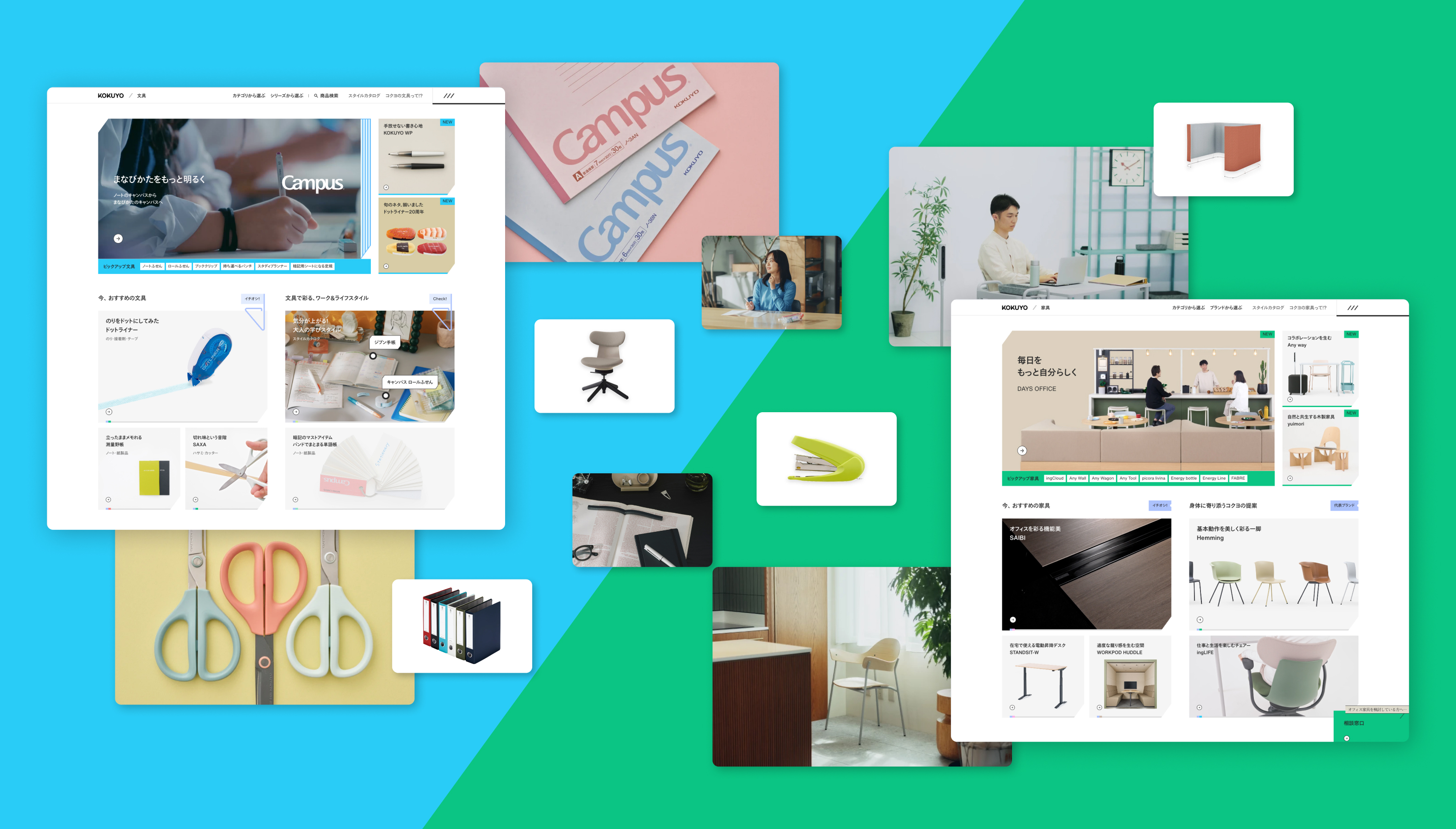
On product pages such as the “stationery area” and “furniture area,” too, rather than merely conveying the merits of the products, we devised a plan called the “Style Catalog” so that visitors could feel the “work style” and “life style” KOKUYO proposes.
A style packed with a life-size, one-step-ahead aspiration, as if you were reading a magazine. It is incorporated as a device that creates horizontal connections between the site’s areas and generates synergy.
Centered on the shared editorial axis of “style,” it connects across fields — stationery, furniture, and even the spatial area.

Valuing a sensory experience
What we valued in common across the whole site was a “sense of excitement.”
In the product area, we built this excitement in mainly three ways.
(1) The thrill of feeling as if you are in a stationery or furniture store
In both the stationery and furniture areas, new products appear one after another.
So on the site, too, we aimed for the excitement of stepping into a stationery shop or a furniture store.
From the perspective of KOKUYO’s own staff, we designed it so they could do VMD (visual merchandising) on the web — like a showcase where they can line up the top-recommended items of the moment.
(2) Bringing out products’ appeal to the fullest through video and stop-motion
A challenge that surfaced in the interviews was that
“still images cannot fully convey a product’s appeal and how to use it.”
We aimed to express on the site the sense — taken for granted in a store —
of touching, trying, and understanding.
So we brought in video that makes uses and functions easier to convey, and stop-motion animation that adds a sense of familiarity. While expressing the features of each product, a sense of play is added to the pages.

-
Designer Tai
-
KOKUYO’s products look serious at first glance, but I think they have color choices and accents you will not find at other companies. In the site design, too, “just the right amount of playfulness” became the keyword. While avoiding flashy motion and decoration, we devised ways to give users a sense of excitement through color and small movements.
*Lower-level product pages and the like are currently in preparation and will be published in due course.
The 377-page strategy document, which served as our anchor in every phase, is also public.
In the following Vol.4, we introduce the behind-the-scenes of producing the “magazine area.” Please look forward to it!
▼The proposal document (377 pp.) is available for a limited time!
Answer a few quick questions to download it!
https://forms.gle/q2ozygdNbB9uQJm19
▼For work inquiries or consultations with mount, clickhere
▼Past articles
・Vol.1: The Full Picture of the Project
・Vol.2: The Corporate Site
Interview and text: Yuriko Horie (mount inc.)